
Impact Map & Community Analytics
Measure impact where it actually happens.
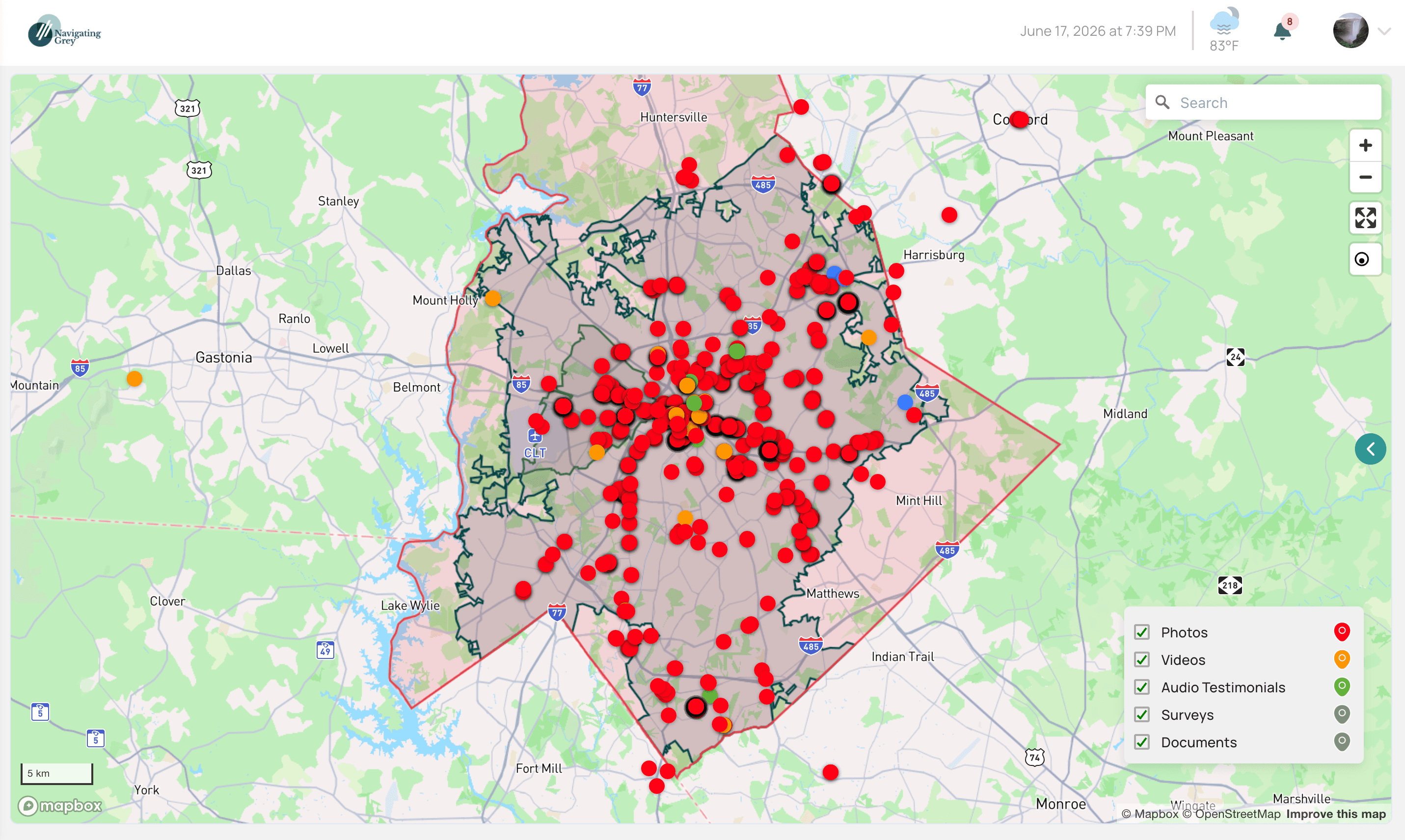
See every initiative on a live map, down to the ZIP-code boundary. Layer in census and Social Determinants of Health data to understand the communities behind the numbers — then score and compare.
The problem it solves
A national average hides what's actually happening on the ground.
Impact lands differently on every block, but most tools reduce it to a single number averaged across communities that behave nothing alike. The moment someone asks where the work landed, a country-level figure falls apart.
What you get
Built for evidence you can defend.
ZIP-level mapping, not pins on a city
Initiatives render on real ZIP-code boundaries with opportunity zones and every piece of evidence pinned in place — so you can see exactly where impact is landing.
Real boundary data, down to the ZIP code.
Census + SDOH enrichment
Income, housing, broadband, health, and more layer over your initiatives automatically, giving every community a profile before you commit a dollar.
Census and Social Determinants of Health, built in.
ROI, Fit, Engagement & Risk scoring
Score initiatives and communities on four axes and put two ZIP codes side by side to compare where your investment will go furthest.
Four-axis scoring, side-by-side compare.
Community Research Library
Study a ZIP before you invest in it — demographics, prior initiatives, and context gathered in one place.
Research a community before you fund it.
Keep exploring
Pairs well with
See it in a demo.
Book a 30-minute walkthrough and we'll show you this on real initiatives, close to your own work.
30 minutes · no pressure, no obligation